
Proje Sunum was a new platform aiming to simplify how real estate professionals present and access international projects. But they needed a mobile app that could deliver the same depth of content as the desktop version — without overwhelming users on smaller screens.
I was brought in to lead the mobile design from the ground up, ensuring the experience was clean, efficient, and tailored to the fast-paced workflows of real estate consultants.
The Problem: DESIGNING FOR DEPTH ON A SMALL SCREEN
Proje Sunum is a content-rich platform packed with detailed real estate data — floor plans, visuals, videos, price lists, documents, and more. Translating that density into a mobile experience was the core challenge.
The app needed to remain lightweight and fast, while still allowing real estate consultants to quickly access everything they need — often in front of clients, and often on limited mobile connections.
The task was to rethink the platform’s structure, prioritize information, and design an interface that could handle complexity without feeling overwhelming.
Here’s what the Project page looked like on desktop:

The desktop version of Proje Sunumu was designed with real estate offices in mind; wide screens, dense layouts, and fast access to vast amounts of project data.
The project overview page features a fixed sidebar loaded with filters and categories, while the search results resemble a spreadsheet, prioritizing data density over visual clarity.

Simplifying Through Progressive Disclosure

To tackle the challenge of dense, data-heavy content, I applied progressive disclosure throughout the app.
Instead of overwhelming users with every detail at once, key information is presented upfront, while additional data and options become visible as users dig deeper.
This approach lets real estate consultants quickly find essential project details on the go, then explore further without feeling lost or overloaded. By layering content thoughtfully, I created a mobile experience that balances depth with clarity and speed.
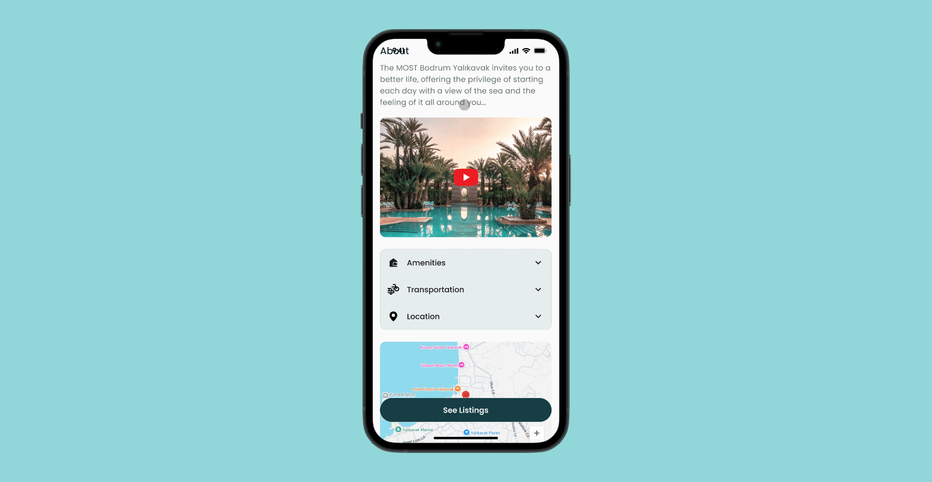
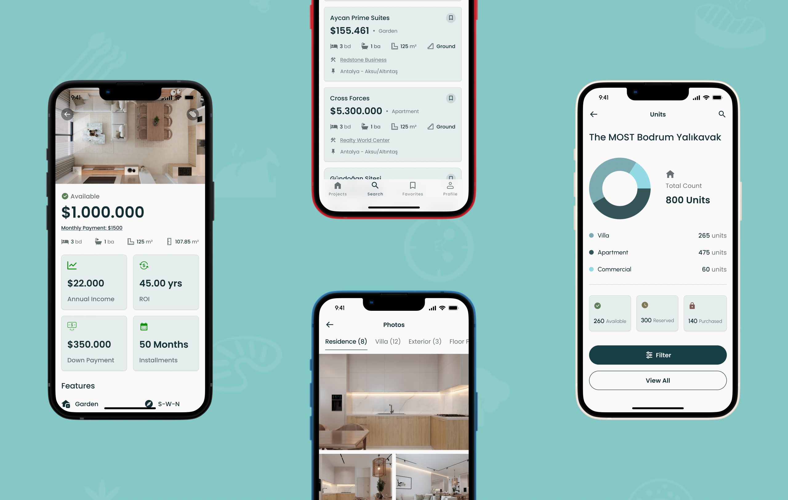
Amenities were moved into an accordion component to keep the interface clean and focused.
Users see key highlights upfront and can expand the section to explore full details only when needed. This simple interaction helps manage space on small screens while preserving access to rich content.
Unit cards couldn’t include visuals, so I had to prioritize information for clarity.

The unit cards feature subtle shadows that add depth and visually separate them from the background, helping users distinguish each option without cluttering the screen.
Typography is carefully applied to create a clear hierarchy, using size and weight variations to guide users’ attention to key information.
Meanwhile, intuitive iconography provides helpful visual cues that simplify navigation and make actions more immediately understandable.
Together, these elements ensure the unit list is both informative and easy to use on a small screen.
Unit page had to fit financial details and key info clearly without clutter.

The unit page contains a lot of important financial information and general details that users need at a glance.
To fit everything clearly on a small screen, I carefully prioritized the content, grouping related data and using visual hierarchy to highlight what matters most.
Charts break down complex data to reveal insights without overload.

Charts simplify complex data by turning raw numbers into clear visual summaries, allowing users to quickly grasp key insights without wading through dense text or tables.
This method supports progressive disclosure, letting users dive into specific details only when they want to, which reduces cognitive overload.
By using visualizations thoughtfully, I kept the interface clean and focused while still providing access to rich information.
Dark mode enhances viewing comfort for presentation environments.
Since the app is designed for project presentations, dark mode plays a crucial role in reducing eye strain during extended viewing, especially in low-light settings.
By offering a visually comfortable alternative to bright screens, dark mode ensures that users can focus on the content without distraction, making presentations smoother and more professional.
Beyond comfort, dark mode adds a sleek, modern aesthetic that aligns with professional presentation settings. It also helps preserve device battery life during long sessions.
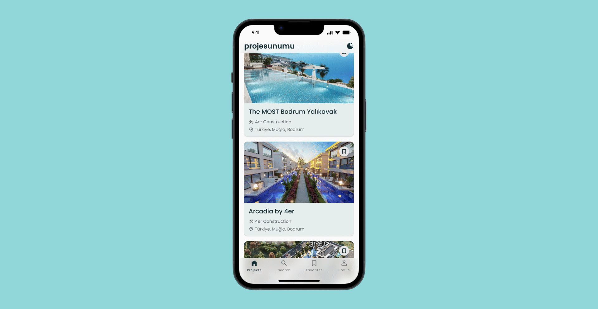
Favorites page keeps top listings easy to access.

The favorites page allows real estate agents to quickly find and revisit key properties without having to search again.
By consolidating important listings in one place, the app streamlines the workflow and helps agents stay organized and focused on the most relevant opportunities.
Wrapping IT Up
With this project, I transformed a data-heavy desktop site into a streamlined, user-friendly mobile app tailored for real estate professionals.
Through thoughtful design choices like prioritizing clarity in unit cards, organizing financial details efficiently, and leveraging features such as dark mode and favorites, the app delivers a balanced experience between rich information and ease of use.
The result is a practical tool that supports agents in managing complex data and making informed decisions, all within a clean, intuitive interface.


