
Discord’s mobile app makes it easy to stay connected, but not to discover. Despite servers being the platform’s lifeblood, discovering them relies heavily on external links and word-of-mouth, since there’s no built-in way to explore communities from within the app.
In this concept redesign, I kept the familiar branding but reimagined the experience around discoverability, making it easier to browse, search, and join new servers directly inside the app.
Communities drive Discord. But discovery is missing on mobile

While Discord thrives on community, its mobile app lacks a native way to explore or discover new servers.
Users must rely on external sources to find and join communities, creating friction in what should be a seamless in-app experience.
This limits user engagement and hinders the organic growth of new or smaller servers.
Even on desktop, Discord doesn’t surface server discovery in a meaningful way. The Explore tab is tucked away at the bottom of the sidebar, easy to miss, even for regular users.
Once opened, it offers a barebones experience: there’s little to no filtering, minimal categorization, and no real sense of what makes each server unique.
Discord, meet your new home.

My redesign introduces a dedicated, visible entry point for exploring servers, placed prominently in the main navigation.
Instead of relying on users to find invite links outside the app, I created an experience that makes discovering new communities part of the journey.
The layout emphasizes categories, recommendations, and previews that feel native to Discord’s aesthetic.
The new Explore page is built like a curated feed, showing communities based on what you already engage with; mutual members, topics you’ve joined before, and interests you’ve selected.
Instead of browsing endless lists, users are now offered a handful of meaningful recommendations each time they visit.
I also introduced filters and dynamic tags to let users dive into specific topics or moods, without needing to know exactly what they’re looking for.
The goal was to turn Explore into a habit, something you casually scroll through, not just a tool you use once in a while.
How will people discover this feature?

It’s easy to think of discovery as a side feature, something that exists somewhere, as long as users can technically find it. But in a product like Discord, where community is everything, where that feature lives matters just as much as what it does.
I didn’t want discovery to feel like a detour. I wanted it to be the product’s starting point, the front door. If Discord is powered by its communities, then placing Discovery at the center makes that value visible right away.
Users shouldn’t have to hunt for new servers or rely on third-party links. Discovery should be the default mode, not an optional path.
Reframing it as the home experience also helped shift the design approach: instead of creating a search tool, I built a space for continuous, personalized exploration. One that feels native to the platform and essential to its future.
If you want something to be seen and used, don’t make people look for it. Put it where they’re already looking.
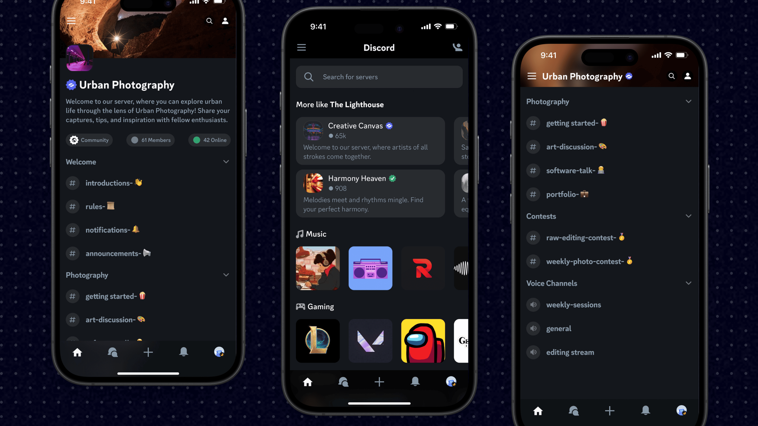
We might as well update the Communities while we’re at it

Current UI
The current Discord mobile app is essentially a compressed version of the desktop UI; same structure, just smaller. But mobile users don’t navigate the same way. They don’t have the screen space or muscle memory longtime desktop users rely on.
This approach works fine if you’re already familiar with Discord, but for new users, it’s disorienting. Key actions are buried, onboarding is unclear, and discovery becomes a dead end. A mobile-first rethink was necessary to make the experience more approachable and intuitive for newcomers.

Updated UI
The updated UI takes a truly mobile-first approach. Instead of shrinking down the desktop layout, I restructured the interface around common mobile behaviors: swiping, tapping, and quick glances.
Navigation is simplified, key actions are surfaced, and the overall flow feels natural on a small screen. Visual elements have been polished to feel crisp and intentional, creating an intuitive experience that works just as well for longtime users as it does for someone opening the app for the first time.
A more intuitive and a mobile-first experience

To create a truly mobile-first Discord experience, I restructured key navigation patterns to better suit small screens.
Channel lists were redesigned using accordions, allowing users to easily browse servers without overwhelming the screen. This kept things clean while still offering quick access to nested categories and active conversations.
For social navigation, I moved the friends list and server list into dedicated mobile-style menus. This mirrors familiar mobile patterns and makes it easier to switch contexts without clutter.
These decisions weren’t just aesthetic; they reflect how users actually move through apps on their phones, with focus, flow, and minimal friction.
While I focused on Communities, I also polished the rest

Direct Messages
The direct messages screen received thoughtful refinements to improve usability without disrupting familiarity. I introduced light shadows to create depth between message threads and the background, making the content feel more layered.
Minimal strokes help define chat boundaries and input areas, improving scannability in long conversations. These quiet adjustments enhanced clarity and structure while preserving the tone of Discord’s original interface.

Texting Experience
I made small visual tweaks to enhance how users text and navigate in DMs. Shadows and strokes separate message bubbles and input fields more clearly, giving each element space to breathe.
These adjustments make it easier to focus on ongoing conversations without making the interface feel unfamiliar. It still looks and feels like Discord, just more readable and mobile-friendly.

Channels
In server channels, I introduced subtle strokes and depth to better distinguish individual messages, pinned items, and input areas. These changes help users navigate long threads and active chats without visual fatigue.
By maintaining the familiar Discord aesthetic while improving structure, I made it easier to follow conversations and interact with content, especially on mobile, where space is limited and clarity matters more.
To wrap it up…
Redesigning Discord’s experience while keeping its core identity intact was a challenge in restraint.
Rather than reinventing the platform, I chose to refine it: improving discoverability, aligning with mobile behaviors, and surfacing the most engaging parts of the app, its communities.
The project’s focus on progressive entry points, adaptive layouts, and hierarchy-aware components allowed me to create an experience that feels intuitive to both new and returning users.
From mobile-specific UI patterns like accordions and bottom sheets, to subtle visual enhancements in chat and server views, every design decision was guided by usability, familiarity, and structure.
Ultimately, this redesign wasn’t about changing how Discord feels, but making it more accessible to more people, especially those joining for the first time. I believe good design invites exploration without overwhelming, and this project was my attempt to bring that philosophy to one of today’s most community-driven platforms.


