Proje Sunum
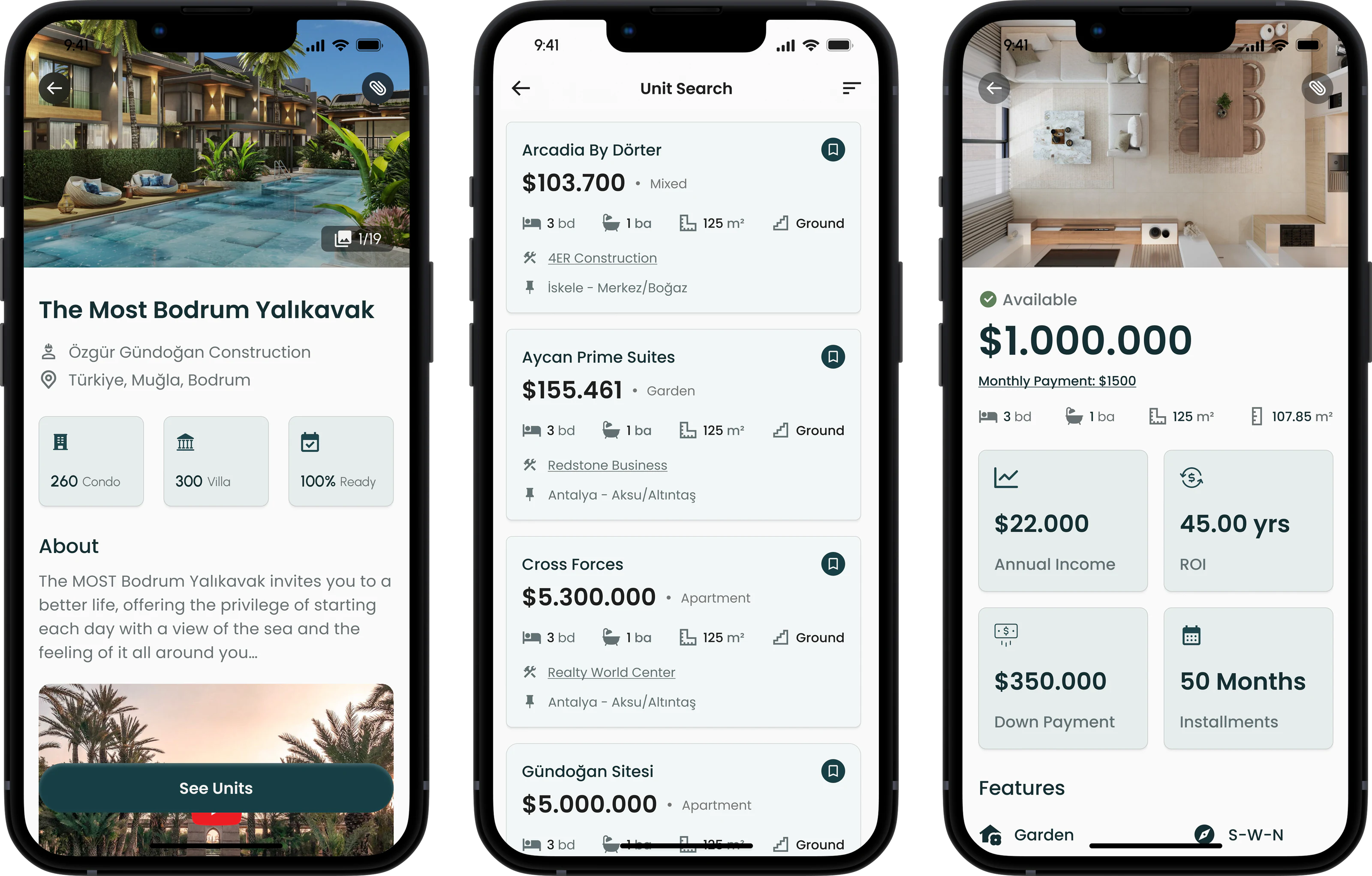
Proje Sunum was a new platform aiming to simplify how real estate professionals present and access international projects. But they needed a mobile app that could deliver the same depth of content as the desktop version, without overwhelming users on smaller screens.
I was brought in to lead the mobile design from the ground up, ensuring the experience was clean, efficient, and tailored to the fast-paced workflows of real estate consultants.
Depth on a Small Screen
Proje Sunum is packed with floor plans, visuals, videos, price lists, and documents. Translating that density into a mobile experience was the core challenge.
The app had to stay lightweight and fast while consultants reach everything they need, often in front of clients and on limited mobile connections.
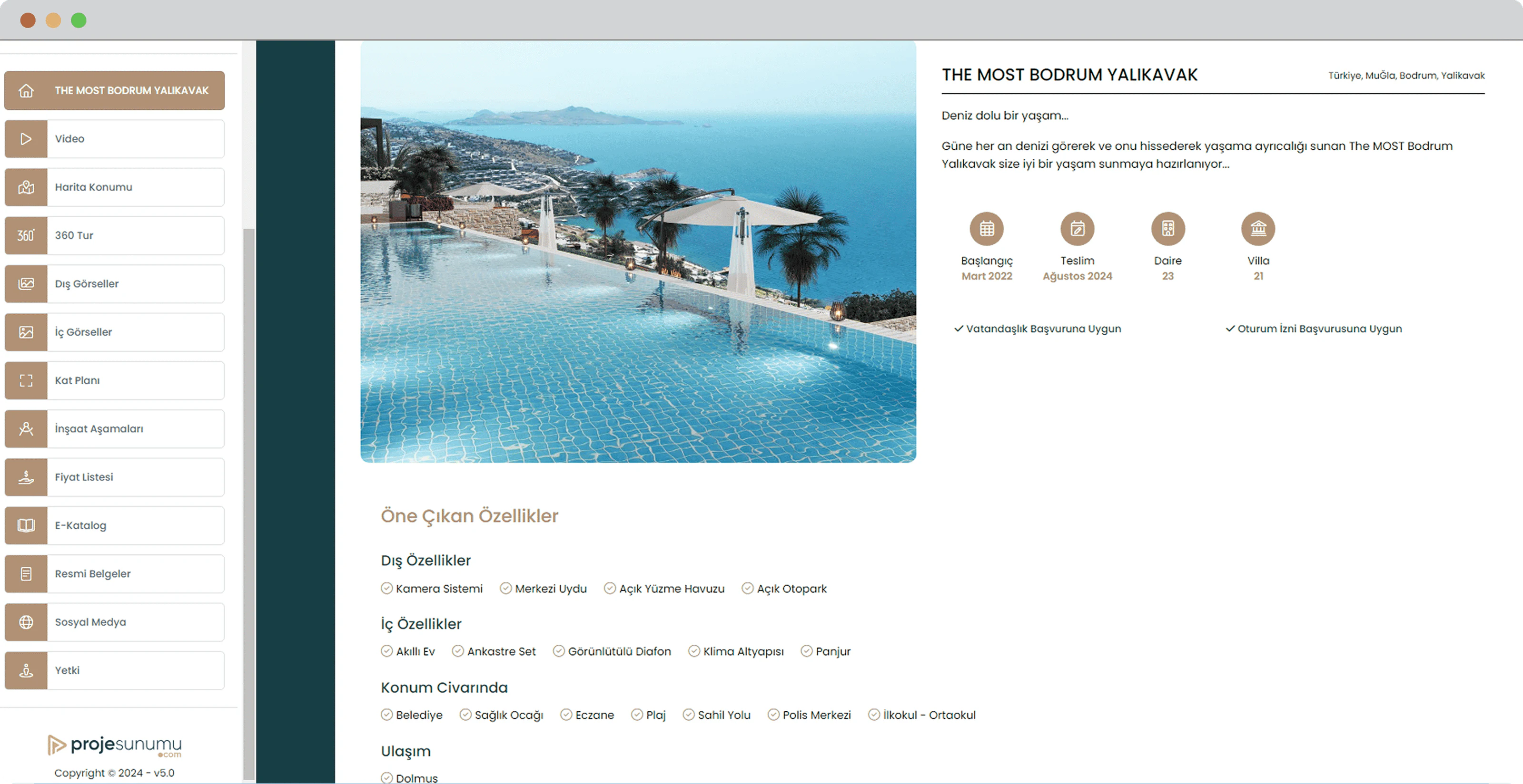
The Project Overview on WebA fixed sidebar of filters and categories.
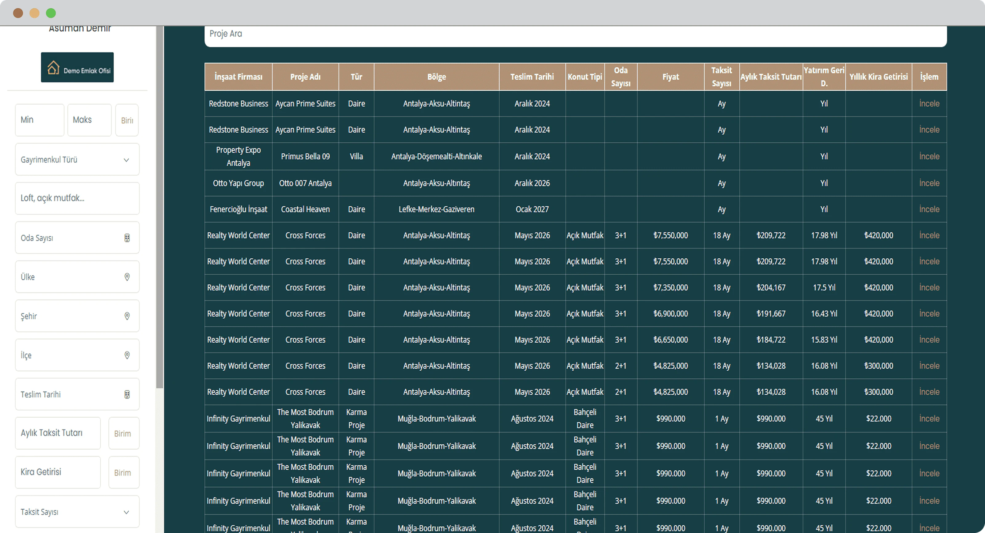
The Search Page on WebResults like a spreadsheet, density over clarity.
Progressive Disclosure
Instead of overwhelming users with every detail at once, key information comes upfront, and more appears as users dig deeper.

The Project Overview Page on MobileA project, one layer at a time.
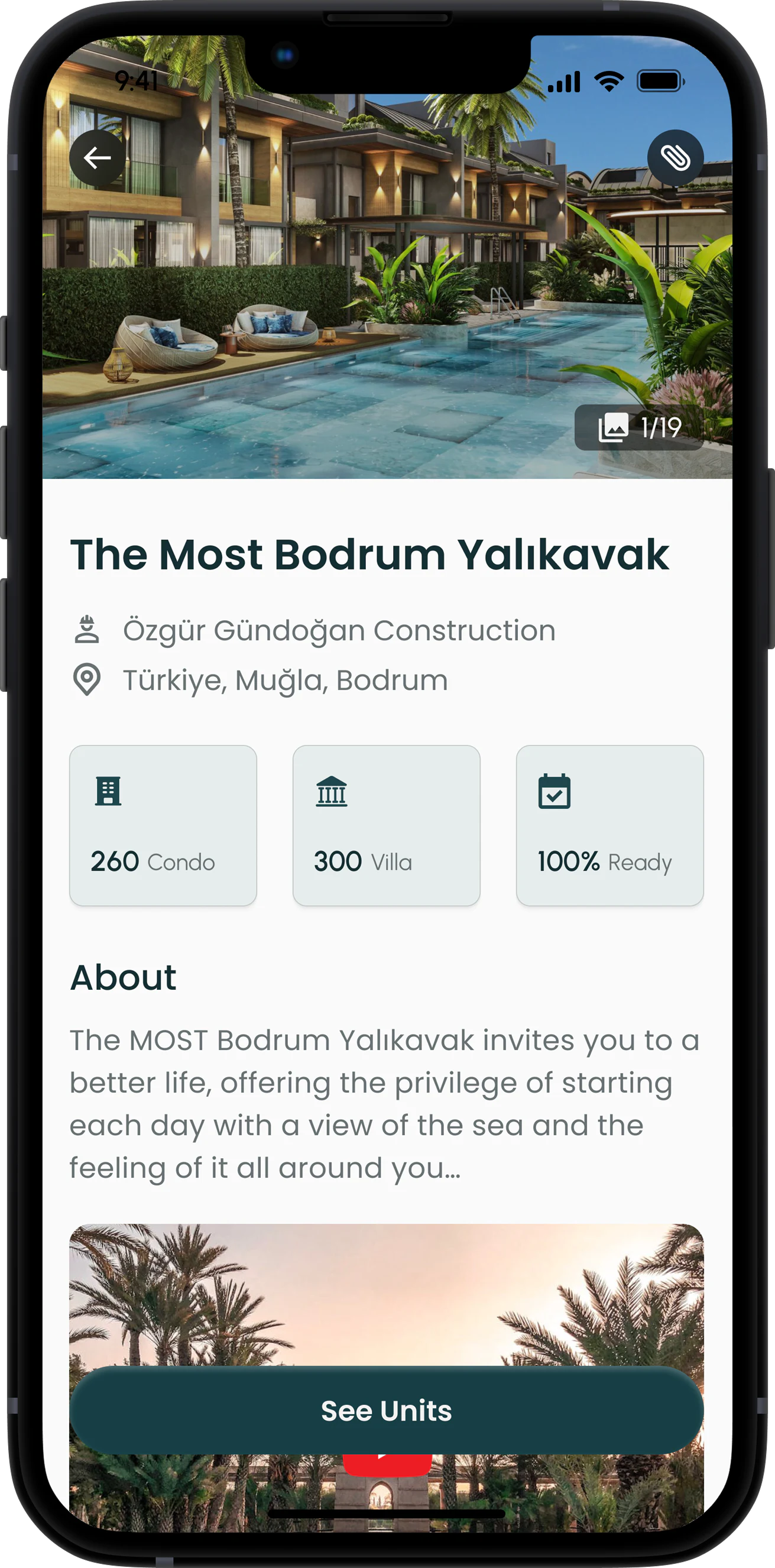
Project ImagesView the uploaded project visuals with one click.
General InfoView basic information about the project, like general info, location, and videos.
Generate PDFGenerate official PDF document to share or download.
Go to UnitsView all units belonging to the specific project.
The AmenitiesHighlights upfront, full details in an accordion.
Unit cards couldn't include visuals, so I had to prioritize information for clarity.
The Unit CardsPrice first, then the details that decide.
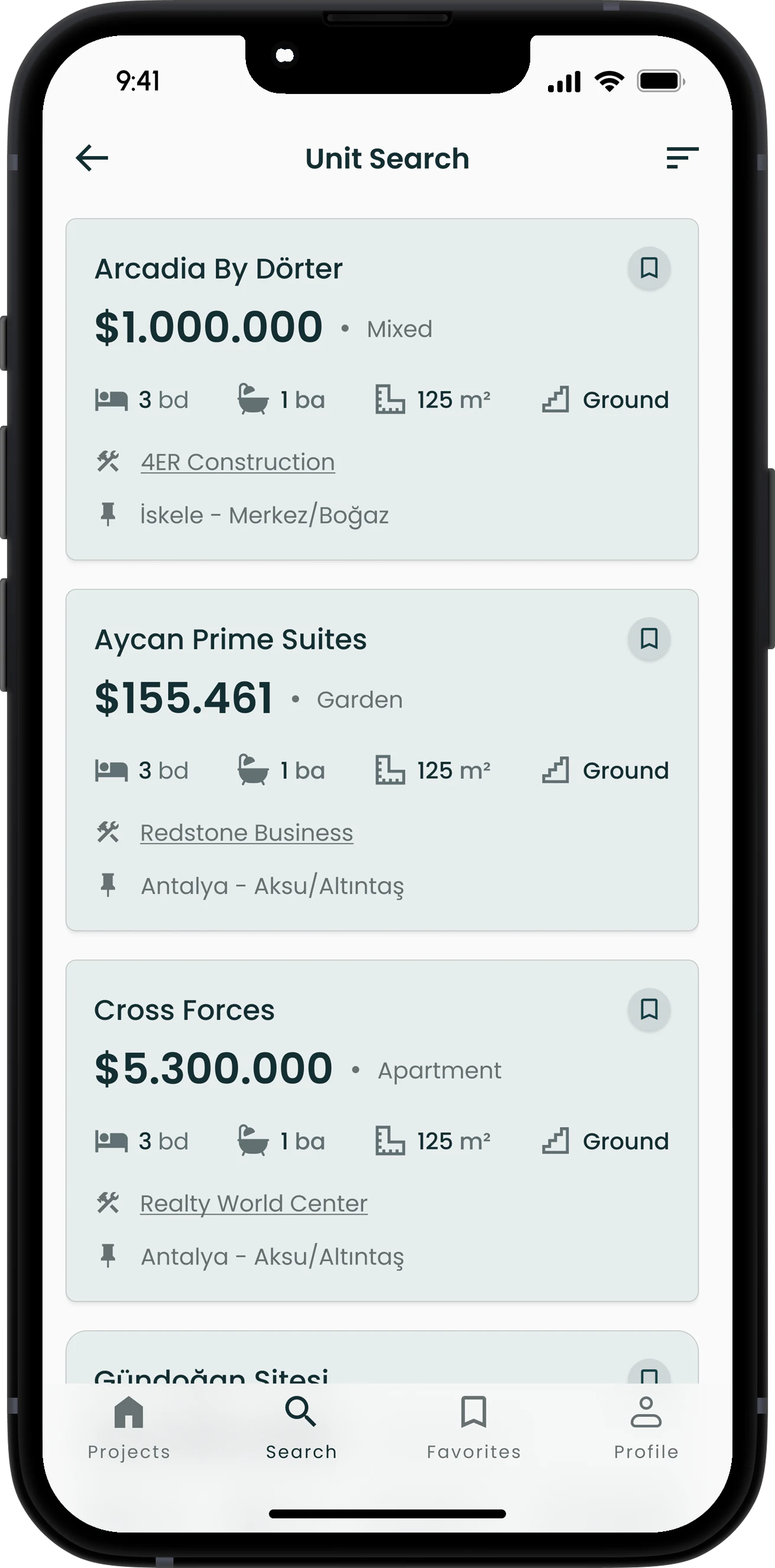
Clear HierarchyI used distinct font sizes and weights to guide users' eyes efficiently.
Subtle ShadowsSubtle shadows on the cards add depth and improve clarity without clutter.
Filter UnitsUsers can quickly narrow down unit options based on their preferences.
Intuitive IconsI selected universally recognizable icons for quick understanding without clutter.
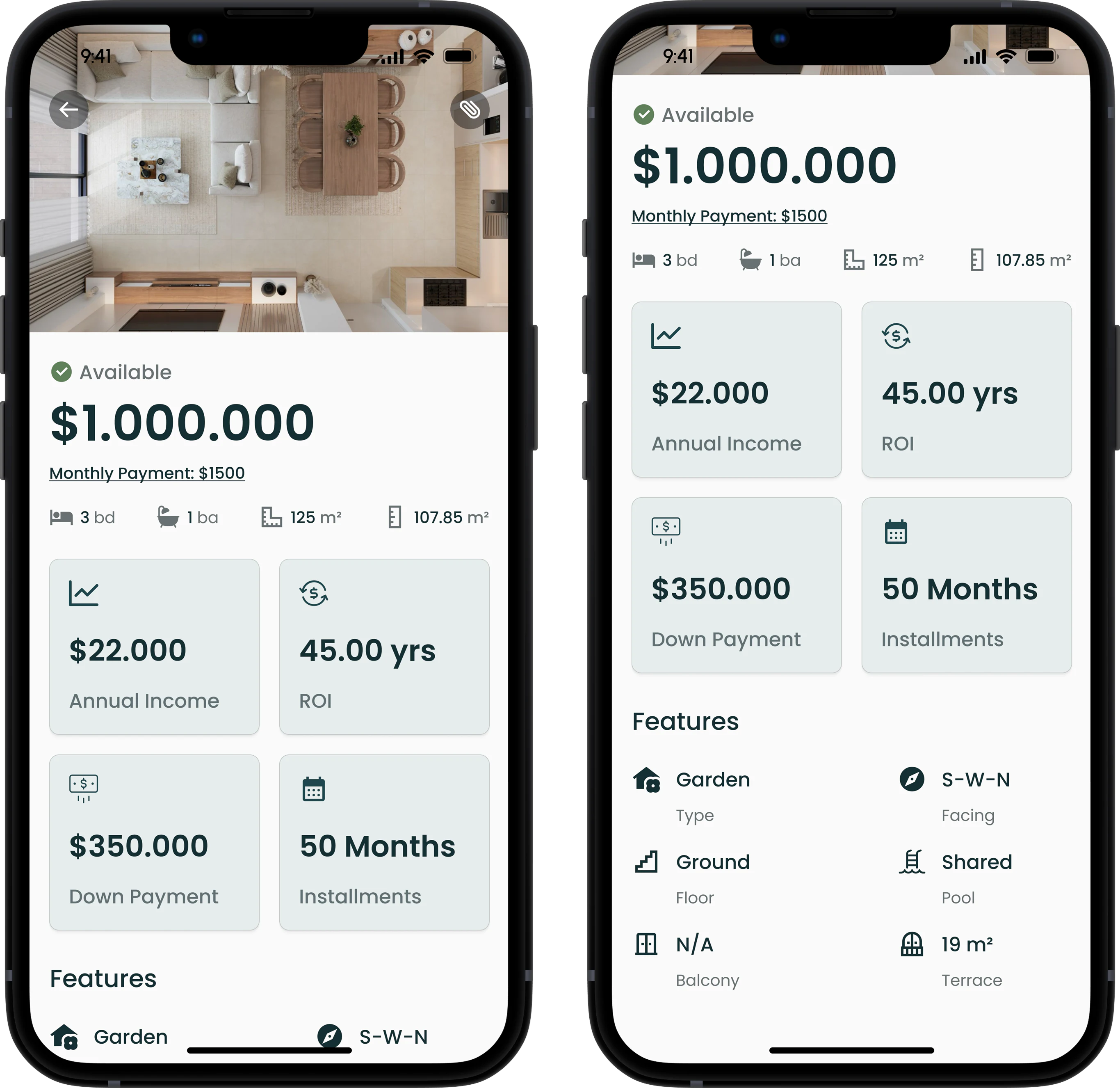
The unit page had to fit financial details and key info clearly, without clutter.
The Unit Overview PageFinancial information, then general features.
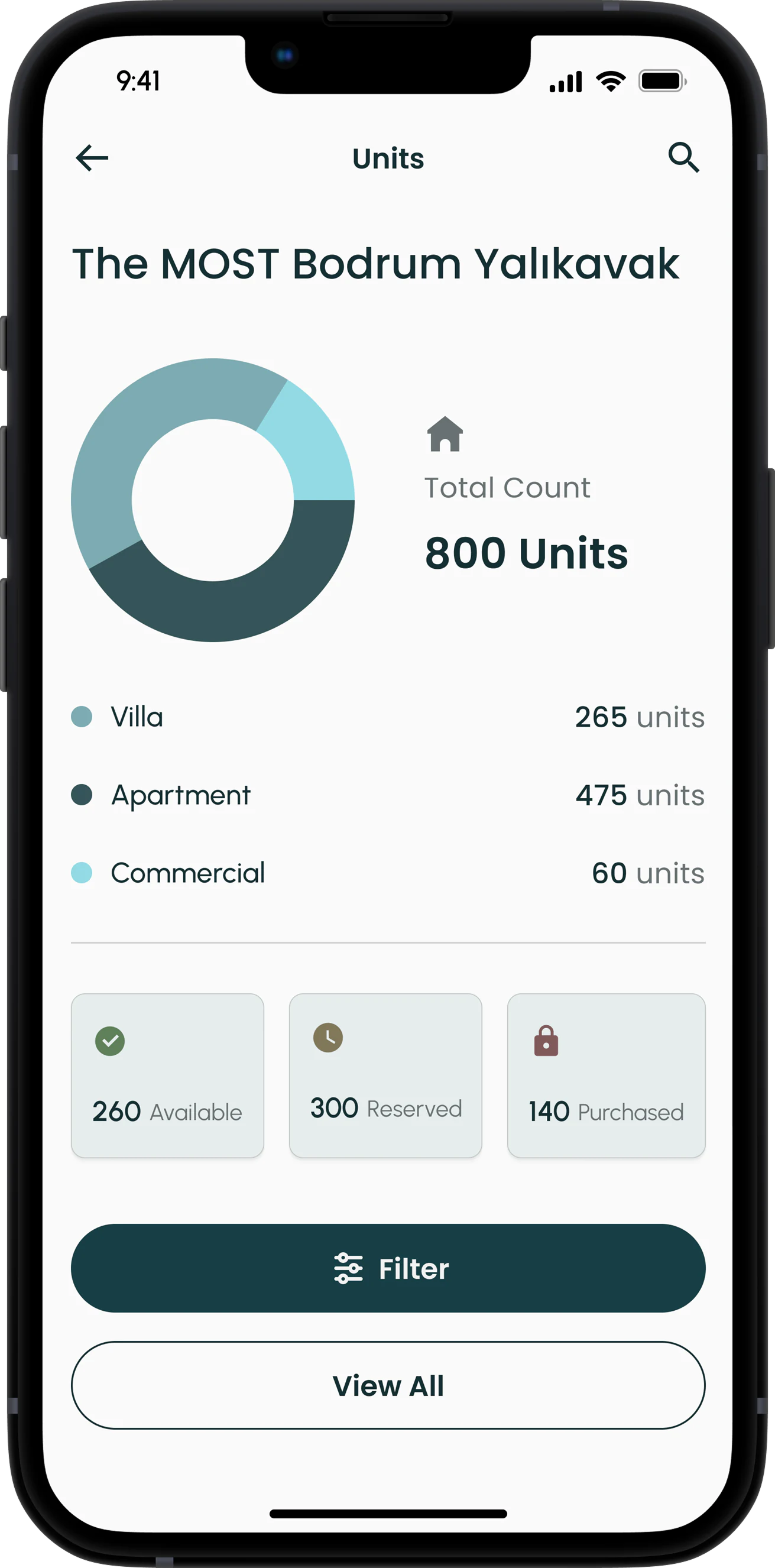
Charts break down complex data to reveal insights without overload.
Dark mode enhances viewing comfort for presentation environments.
Project DataUnits by type and by status.
Dark modePrototyped by using variable modes in Figma.

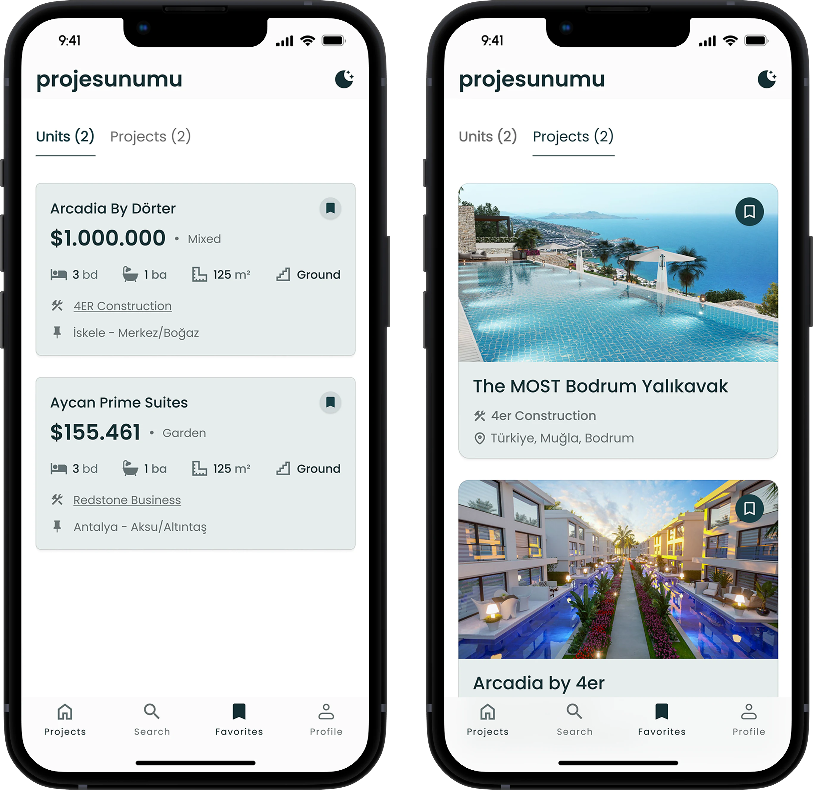
The favorites page keeps top listings easy to access.
Favorites SectionSaved units and projects, without searching again.
Wrapping It Up
I transformed a data-heavy desktop site into a streamlined, user-friendly mobile app tailored for real estate professionals, balancing rich information with ease of use.